Branding · Visual identity
Hila needed an identity that conveyed how natural and handmade the product is without losing freshness. The logo grows out of a slice of dried orange that turns into a letter.
- ROLE
- Logo design, visual system and brand guidelines
- YEAR
- 2026
- TOOLKIT
- Illustrator · Photoshop · Mockups

01 — CONCEPT
The orange slice replaces the H, and the line running through the name works as a thread — a nod to the brand's name ("hilo" means thread in Spanish). The result is a symbol that stays recognizable even at the smallest sizes.
02 — BRAND MANUAL
Use the arrows or swipe to turn the pages
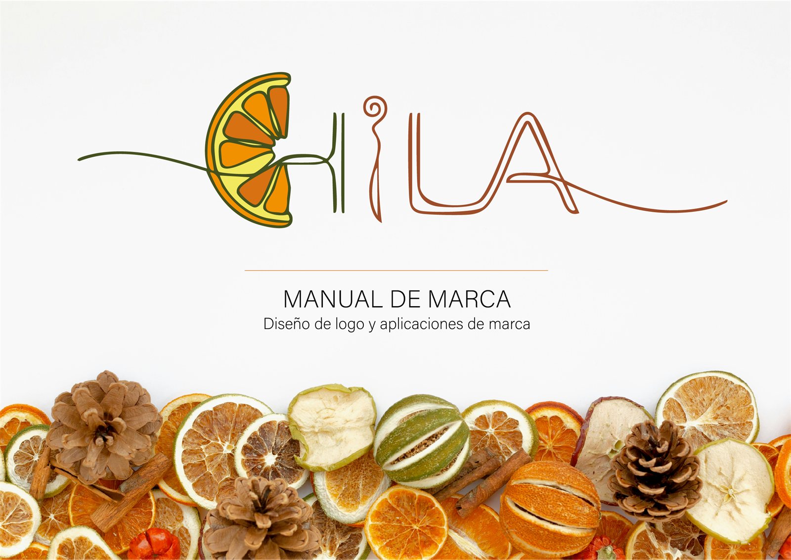
01 / 37
03 — SYSTEM
- 01
Construction and clear space
Construction grid, safety areas and minimum sizes for print and screen.
- 02
Typography
Nunito Sans as the primary typeface and Rubik for digital media.
- 03
Color
Palettes for print and screen, one-color versions, negatives and grayscale.
- 04
Correct and incorrect use
Clear examples of what to do and what to avoid when placing the logo over photography.